MOON
Designing a femtech app from scratch
My role: Generative research, research synthesis, interactive prototyping, evaluative research/usability testing, iterative design, client deliverable report
Tools
Figma
Keynote
Adobe Photoshop
Methods
Directed Storytelling
Affinity Mapping
Information Architecture
Think aloud usability testing
Deliverables
The Users

The identified user group includes people with uteruses who want a health app that goes beyond cycle-tracking, and helps them navigate the mysterious world of the effects of hormones. In addition they want to know what lifestyle choices they can make to minimize the negative symptoms and make the most of the positive ones.
Context
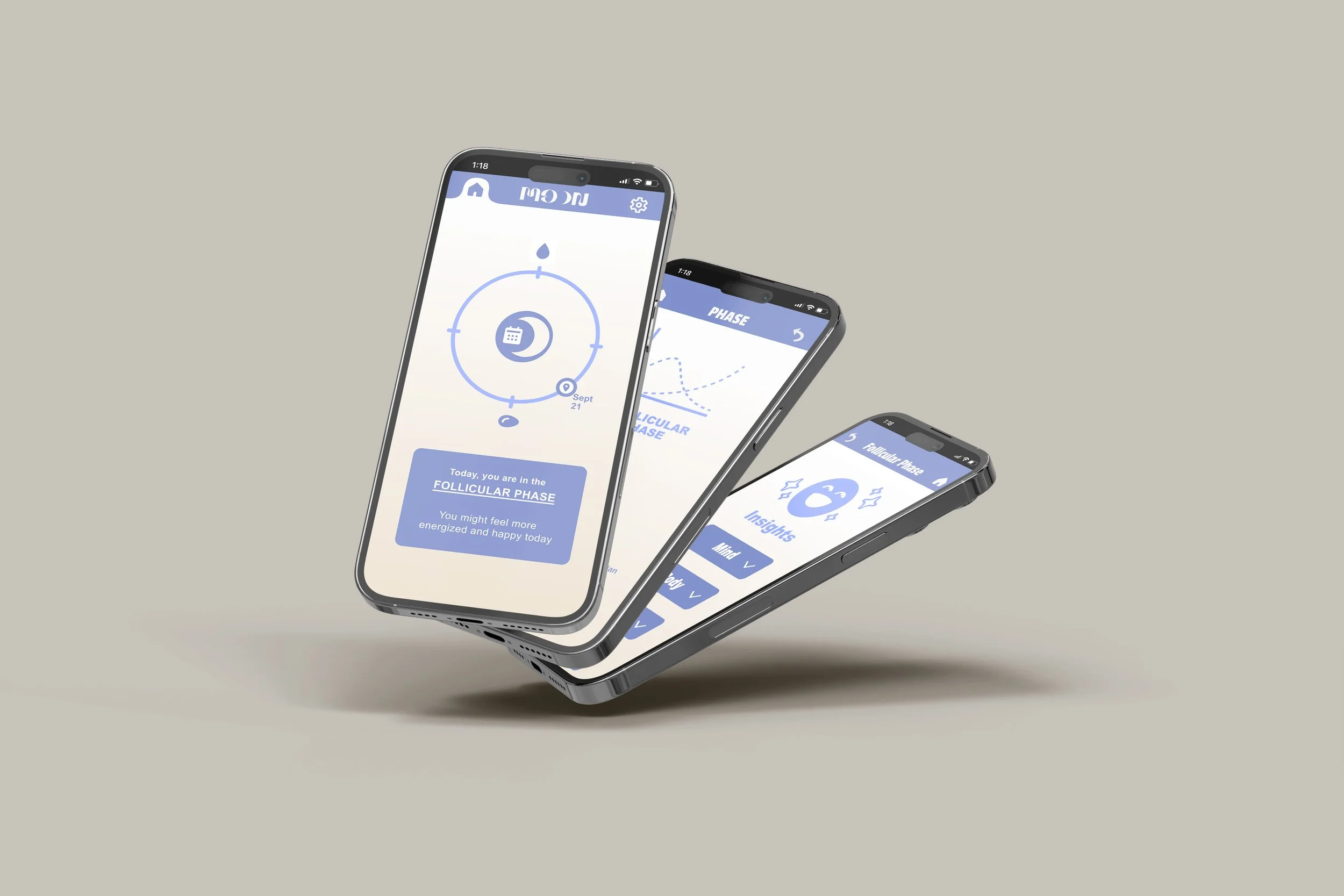
Moon is a hormone and menstrual cycle-tracking app designed to give people with uteruses insights on what to expect in different hormone phases, as well as lifestyle tips curated to each phase. Moon is meant to make hormone education accessible from puberty to pregnancy to menopause and everywhere in between. It answers the question, “Is this normal?” and aims to bust the taboos around women’s health. With a simple interface, it focuses on today, and how we can approach the day educated and prepared to make it better.
The Process
Hormones: The Hidden Influencers of Wellbeing, Unveiled by a Unique App
Hormones not only affect how people feel emotionally, but they also govern how we think, how much energy we have, and what we need on a given day. It’s such a crucial aspect of health and wellbeing, but is often neglected and misunderstood. It seemed to me that there was a gap in the market for an app that helps people with menstrual cycles get in touch with this fluctuating part of themselves in a world that expects them to be the same every day.
“Growing up with 4 brothers, [being a woman] felt alien”
How storytelling uncovered feelings of isolation and the need for hormone awareness
A directed storytelling method was used to understand how women feel about women’s health apps that they’ve used, and how their relationship with their health defines their needs. I noticed that the latter prompt gave me a lot more information about pain points, which helped direct unique features of the app. Since the focus group was made up of only three participants, it limited research, however some patterns emerged that were alarmingly distinct.
Each participant wanted to know what to expect from hormones, and whether the symptoms they experienced were unusual. All participants felt that women’s health was hard to talk about, which made them feel isolated when questions came up about it.

Iteration, prototyping, and evaluation
Iteration:
I started brainstorming by sketching some ideas. I incorporated a circular cycle tracker as the main element on the homepage as the menstrual cycle should have hierarchy over other elements. Also on that screen I created a “Today” button that leads to another page where the user can find daily tips on what to expect for mental and emotional symptoms, what to eat, and what kind of exercise to do in this particular hormone phase. I organized the tips into drop-down buttons to keep the interface simple.
Once I began prototyping, I tweaked information architecture as needed. After getting my interactive prototype approved to move forward, it was time to put the functionality of the app to the test using think-aloud user testing. Since this project was quick (over the course of two weeks), I expected the app to have issues, but I wasn’t expecting the happy path to be as hard to find as it eventually proved to be..
Working without a team made this project difficult because creating a product from scratch requires many perspectives working together. However, the user research and testing helped immensely with advancing the project and providing valuable perspective.
First Digital Wireframe Iterations

Evaluation:
Fortunately the findings from the usability testing were fairly consistent between participants. This allowed me to make changes to the layout and information architecture of the app to make it the most intuitive for its users. Participants were given tasks to navigate to certain important screens, and while most of them failed, there was enough consistency in the mental models for me to know, not only where the app needed improvements, but also how to fix it. If all participants failed to find a page they were prompted to find, most of them navigated to the same place to find it.
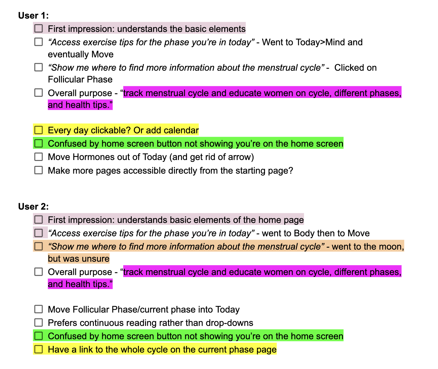
Research-directed improvements to optimize usability and design
Finally, in response to the research, I merged two buttons on the homescreen in order to optimize findability of the daily recommendations. This helps guide users toward the happy path by limiting their immediate options without reducing overall content.
I also added a calendar element to the home page, because it became clear in the usability test that most users expect that. This will also allow them to access and log information about hormones and symptoms which is essential to the functioning of the app.
Updated Mid-fidelity Wireframes
View/download a PDF of the Findings Report here.
Going Forward…
If I had more time to work on the project, I would first rework information architecture to address any necessary changes that accompany the new elements that were added. Then I would build the calendar page so that users can access past and predicted cycles. I would also conduct more usability tests to determine whether the changes helped the design and whether more changes were necessary.
I’ve learned an incredible amount during this project. If I could do it over again, I would have more participants in my research groups. Especially for a brand new product, 3-4 participants feels like too little to judge the needs of a massive target audience (although we can learn a lot). I would have liked to spend more time on all phases of this project, (and I especially would’ve liked to have spent more time on mapping information architecture), but it was useful to gain experience working with limited resources and in a restricted time frame.