Lucid Athlete
Designing and prioritizing new features for an app in its beta-testing phase
My role: prototyping and designing new features, client deliverables (User Journey Map, Recommended Features Report)
Collaboration: research and synthesis, client deliverables (competitive audit)
Tools:
Miro
Figma
Adobe Photoshop
Google Sheets
Keynote
Zoom
Methods:
Competitive Audit
Stakeholder Interview
User Journey Map
Tech Scoping Interview
Kano Analysis
The Client
TC Design Forge LLC is a Minneapolis-based company that provides a wide range of design services. TC Design Forge is run by a power-couple, a wife/husband duo who are both tech industry veterans. Lucid Athlete, being their first project together, is born of a passion for creating an app that is both beautiful and simple, while also being useful, accurate, and powerful.
The Problem
Lucid Athlete is a fitness app in its alpha (internal testing) phase. Lucid Athlete seeks to fill the gap between over-priced, over-complicated health apps, and oversimplified health apps that provide little-to-no actual value or accuracy. The main goal of Lucid Athlete is to provide clean, actionable, data-driven fitness insights to athletes so that they can optimize recovery and minimize burnout, while progressing their fitness, and in turn their daily lives.
The Solution
High-priority features were recommended to the client via a report containing annotated, high-fidelity wireframes. Selection of these features was informed by Kano analysis, competitive audit, and input from stakeholders and developers.
What Surprised Me
While some features provide a simple task for UX designers, they may require extensive work for a developer. This is why the tech-scoping interview with the developer was so valuable to my team. We were able to get an idea of the workload each feature would carry for the developer, as well as the developer’s time budget. This crucial information helped decide which features to prioritize, as well as scope for the project.
The Users
Millennial endurance athletes are the primary user group. These users have an iPhone and an Apple Watch, or other wearable device that feeds data into the Apple Health app. Their goal is to achieve maximum fitness gains and minimize their time being sick, so they can optimize their training. Other users might include Generation Xers who are dedicated to their sport and are willing to invest in anything that will give them an extra edge in competition.
The Process
Research
A competitive audit was conducted to evaluate what similar competitors are doing, what they are doing well, and what they are not doing well. This allowed for inspiration and provided insight into any market gaps.
What already exists in the market?
A stakeholder interview got my team up-to-speed on overall product concept, stakeholder goals, user group and goals, inspiration, and ideas for UX opportunities.
Next, I created a User Journey Map to tell the story of the current user experience with similar competitor apps, and to highlight how the user’s journey could potentially change for the better with Lucid.
What do we have so far?
View/download a PDF of the user journey map.
Prototyping
Each team member’s numerous ideas for the app were made tangible by creating rapid prototyping sketches. In a meeting with the developer, development points were given to each feature sketch to estimate how much time it would take to code them. We were also given a budget of 30 points to help us choose features to recommend within a feasible scope.
My seven feature ideas
My team used dot-voting to choose which features we wanted user feedback on. Thirteen features were then assessed using the Kano analysis method to discover how desirable each feature would be to the user group.
View/download a PDF of the full Kano Analysis.
Final Solutions
High-fidelity designs
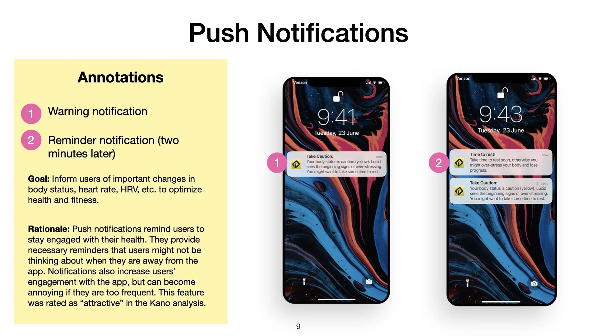
Based on what I learned from a variety of research methods and the development budget, I chose four features to move forward with. Key screens of these features were made into high-fidelity wireframes, annotated, and presented to the client in a slide deck report.
Check out my rationale for choosing each feature on the slides.
Some factors that were considered were:
How highly rated the feature was on the Kano Analysis
Development budget and tasks required
Stakeholder goals
User goals


View/download a PDF of the full report.
How I grew
Design systems - As much as I love being creative and making aesthetic recommendations or decisions, it’s really nice to have a design system to work within so that I can prototype something beautiful while focusing on the UX. As Lucid is an app designed for iOS, I got to learn a little bit more about the Apple Design System and create designs that are familiar and intuitive to Apple users. I got to access resources, like components and design principles, which assist in the efficient creation of high-fidelity designs.
Going forward, I would recommend that the client continues to prioritize new features that will be most enjoyed and expected by users. To make the most of the development budget, Lucid should consider building off of features that already exist, utilizing existing code for data cache and user input, for example.